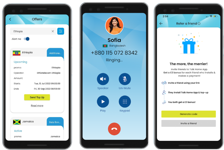
For nearly three decades, Talk Home has been a trusted name in global telecommunications. What began as a simple international calling card business has evolved into a comprehensive communications platform, helping over 18 million users connect with family and friends worldwide every month. Our commitment to providing reliable, flexible, and cost-effective solutions has positioned us as a globally recognized and respected brand. The Talk Home app is the latest step in our journey, designed to deliver unparalleled connectivity in an increasingly digital world.
The Challenge
As communication technology advanced, our customers’ needs evolved. They wanted more than just affordable international calls—they needed flexibility, convenience, and an all-in-one solution that would allow them to stay connected anytime, anywhere. With numerous options available in the market, we faced the challenge of not only meeting these expectations but exceeding them. We needed to create an app that seamlessly integrates with existing services, offers competitive rates, and is simple enough for everyone to use, without sacrificing quality or reliability.
The Solution
As communication technology advanced, our customers’ needs evolved. They wanted more than just affordable international calls—they needed flexibility, convenience, and an all-in-one solution that would allow them to stay connected anytime, anywhere. With numerous options available in the market, we faced the challenge of not only meeting these expectations but exceeding them. We needed to create an app that seamlessly integrates with existing services, offers competitive rates, and is simple enough for everyone to use, without sacrificing quality or reliability.
The Result
Tools & Libraries
Design System
Primary Color
Blue is often associated with trust, reliability, and professionalism—all qualities that Talk Home embodies. This shade of blue evokes a sense of calm and confidence, making users feel secure in their choice. It’s also a color that stands out in the digital space, ensuring our app is both memorable and visually appealing.
Typography
We use the Poppins font family throughout our app and branding for its modern, clean, and highly legible design. The geometric sans-serif style of Poppins aligns perfectly with our brand’s commitment to clarity, simplicity, and user-centricity. It’s a font that not only looks good but also enhances readability, ensuring that our messages are always clear and accessible to all users.
EtechViral is a globally recognized app development company. We specialize in adopting emerging technologies, deep technical expertise, and comprehensive functional knowledge.