
AgriTech
Internal
Ghazi, Haripur
UX/UI Design, Prototyping
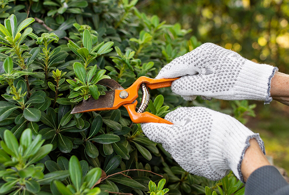
At ETechViral’s office in Ghazi, Haripur, plants were dying. Leaves turned yellow. Brown patches appeared. Insects showed up on stems. Nobody knew why, and nobody knew what to do.
The problem was not that people did not care. It was that they did not know. Nobody in the office could tell whether a yellowing leaf meant too much water, too little water, a pest, or a nutrient issue. And because plant care was nobody’s specific job, the plants kept getting worse.
This is not a problem unique to one office. Most people who own plants, at home or at work, face the same gap. They can buy a plant. They cannot keep it alive. The apps that exist either show a list of general tips or send daily reminders with no diagnosis behind them. Neither actually solves the problem.
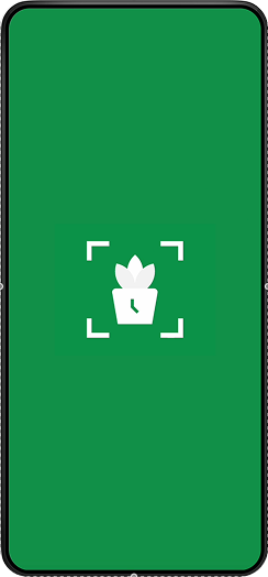
We wanted to build something that could look at a plant and tell you what is wrong with it, and then tell you exactly what to do.
Before drawing any screens, we made one decision that shaped everything else: the AI in this app gives information, not orders. The user decides what to do. This kept the app from feeling cold or robotic, and made sure people stayed in the habit of actually looking at their plants rather than just following instructions blindly.
We designed the full app in Figma and tested it with real people using Maze before writing any code. This is how we work on all our projects. Changes made in Figma take minutes. The same change made after development takes days and costs real money. Testing the design first means we build the right thing from the start.
We ran participants through the main flows, scanning a plant, setting up a care reminder, using the plant doctor. We watched where they got confused, where they moved confidently, and what they said afterward. That feedback went back into the design before anything was finalized.
We used Adobe After Effects to design the transitions and small animations in the app. These were not added for visual interest. Each one confirms an action, guides the user's eye, or signals that something is loading. Animations that do not have a purpose were left out.
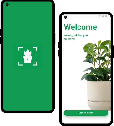
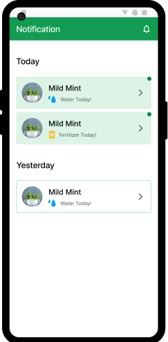
The first time a user opens the app, they add a plant immediately. There is no long setup or series of forms. The first screen asks one thing: what plant do you have? That single action starts the habit the app is built around. Users who add something on day one are far more likely to come back.
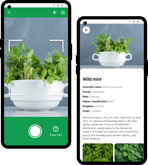
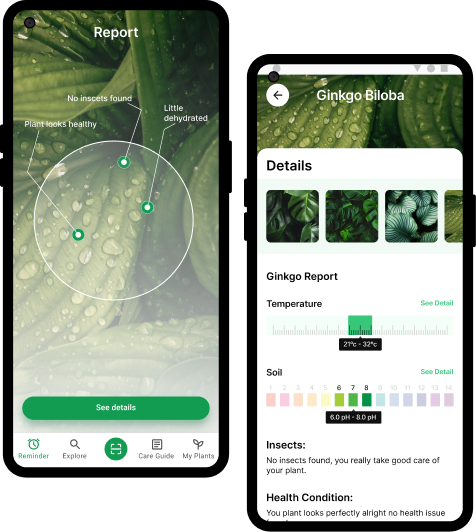
The plant doctor asks the user a short set of questions about what they are seeing, yellow leaves, brown tips, spots, drooping. Based on the answers, it returns a specific cause and a specific fix. Not a list of possibilities. One answer with clear steps. A plant with yellow lower leaves gets a different answer than one with yellow leaves across the whole plant.


A few choices in the design reflect a specific reason, not just a visual preference:
UI screens, component library, design system
User journey mapping and early planning
User testing
UI screens, component library, design system
User journey mapping and early planning
User testing
Interactive prototype
Writing and design thinking support
Icons and brand graphics
Interactive prototype
Writing and design thinking support
Icons and brand graphics
Core Flows Designed
Positive in User Testing
Design Approach
We designed seven complete user flows and tested them with real people. Every participant understood what the app did without explanation. Nobody got lost in the main flows. The plant doctor feature got the strongest positive response, users liked that it gave them one answer instead of a list of maybes.
The screens, components, and animations are fully specified and ready to hand to a development team. Building can start without any redesign or guesswork.
This project also confirmed something we apply to all client work: designing and testing before building is not slower. It removes the back-and-forth that happens when you build something, test it on users, and then rebuild it. One design cycle done properly costs less than two partial development cycles.
Plantport moves into development next. The app will be built in Flutter with a Firebase backend. The plant scanning feature will connect to an AI model for species identification and health analysis. Push notifications will be handled through Firebase Cloud Messaging.
Everything designed in this phase goes directly to the development team as the build specification. No redoing work. No figuring out what screens were supposed to do.