As you know, AlertDialog is not just a feature, it’s a conversation starter between your app and its users. In the bustling streets of app development, Flutter stands tall, offering a canvas for creators.
AlertDialog, a crucial tool in this toolkit, ensures your app doesn’t just speak but listens, making every interaction count.
Why does this matter? Because in the digital age, engaging users is the key to an app’s heart and success. Today we will learn how to insert Flutter alertdialog and also the advance customization with practical examples to make your app not just functional, but unforgettable.
What is AlertDialog and why does it matter?
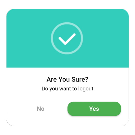
In Flutter, AlertDialog is a shining star. It’s like a friendly chat window in your app that pops up to say something important. Imagine you’re playing a game and you’re about to make a big move. Suddenly, a small box appears asking, “Are you sure?” That’s AlertDialog in action. It’s there to make sure you’re making the choice you really want to.
Key properties of AlertDialog box
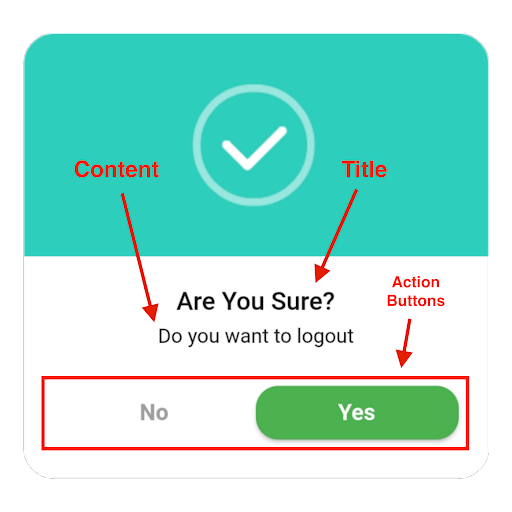
AlertDialog matters a lot because it’s all about communication. It’s how your app talks to its users in those key moments, making sure they’re on board with what’s happening. This little dialog box can make a big difference in how people feel about your app. It’s like having a polite conversation instead of just being told what to do.
Now, let’s talk about what makes an AlertDialog tick. First off, it’s got a title. This is like the subject line of an email. It tells you what this chat is all about. Then, there’s the content, the message part where your app explains things a bit more. And don’t forget the actions. These are the buttons at the bottom that let you say “yes,” “no,” or sometimes “maybe.”
Getting Started with AlertDialog
Before diving into the world of AlertDialog in Flutter, let’s get our ducks in a row. First things first, you need to have Flutter installed on your computer. Think of Flutter like the paint and your computer as the canvas. Without the paint, you can’t create your masterpiece.
Now, once Flutter is up and running, there’s a bit more prep work to do. You’ll need an editor to write your code. This can be anything from VS Code to Android Studio. It’s like choosing your favorite paintbrush. And don’t forget to set up an emulator or have a real device handy. This way, you can see your app come to life as you build it.
If you don’t know how to set up Flutter in your machine, eTechViral is here to help you. Head on over to the video below:
Next up, we need to talk about packages. In the Flutter world, packages are like special tools that help you do more with less effort. For AlertDialog, you won’t need anything fancy. Flutter comes with everything you need right out of the box. But, it’s good practice to check your pubspec.yaml file. This file is like a shopping list for your app. It tells Flutter all the packages you want to use. Make sure everything is listed there before you start coding.
How to Insert Flutter Alertdialog in Easy way
Now that we’re all set up, let’s walk through how to bring AlertDialog into your Flutter app, step by step. Think of AlertDialog as a friendly pop-up, giving your users a heads-up or asking them to make a choice. It’s like a crossroads in your app’s journey, where the user decides which path to take.
Constructor and parameters of AlertDialog
Every AlertDialog needs a constructor. This is just a fancy way of saying you need to start by telling your app you want to use an AlertDialog. You do this by adding AlertDialog() in your code. Inside those parentheses, you can customize your dialog with parameters. Parameters are like options on a menu, letting you pick exactly what you want your AlertDialog to say and do.
Implementation basics
For a basic implementation, you’ll need a few key ingredients. Start with a button that, when tapped, will show the AlertDialog. This is like the doorbell to your AlertDialog’s house. When the button is pressed, the AlertDialog appears.
Here’s how you add a simple AlertDialog:
- Create a function that shows the dialog.
- Inside this function, use showDialog(), a Flutter function that does exactly what it says.
- In showDialog(), you’ll need context (where to show the dialog) and a builder (what the dialog will look like).
For the builder part, you return an AlertDialog widget. Here, you can add a title, content, and actions—like “Yes” and “No” buttons. It’s like setting the table for dinner; you decide what goes on the plate.
Let’s talk about code. Here’s a snippet to show a basic AlertDialog:
showDialog(
  context: context,
  builder: (BuildContext context) {
    return AlertDialog(
      title: Text('Alert!'),
      content: Text('This is a simple alert dialog.'),
      actions: [
        ElevatedButton(
          child: Text('OK'),
          onPressed: () {
            Navigator.of(context).pop(); // Closes the dialog
          },
        ),
      ],
    );
  },
);
In this example, when the “OK” button is pressed, the dialog closes. It’s like saying, “Message received,” and moving on.
The output? When you run this code and tap the button, a dialog pops up with a title, a message, and an “OK” button. It’s a straightforward way to communicate with your users, making sure they get the message loud and clear.
And there you have it—a simple guide to adding AlertDialogs to your Flutter app. With just a few lines of code, you can make your app more interactive and informative.
How to Craft Your First AlertDialog in Flutter?
First up, let’s break down the AlertDialog widget. Think of it as a blank canvas. You have the power to decide everything that goes on it. The title and content are your paint and brush. You can set the title to grab attention and the content to deliver your message. It’s straightforward: just use the title and content parameters.
Customizing your AlertDialog doesn’t stop there. You can add buttons to guide users on what to do next. Adding buttons is like giving directions at a crossroad. You can have buttons for “Yes”, “No”, or “Cancel”. Each button can do something different. For example, “Yes” could mean accepting an offer, while “No” could mean declining it.
Creating a customizable AlertDialog is simple. Here’s a quick example:
AlertDialog(
  title: Text('Confirm'),
  content: Text('Do you want to proceed?'),
  actions: [
    ElevatedButton(
      child: Text('Yes'),
      onPressed: () {
        // Code to do something
      },
    ),
    ElevatedButton(
      child: Text('No'),
      onPressed: () {
        Navigator.of(context).pop(); // Close the dialog
      },
    ),
  ],
);
In this snippet, we’ve set up a dialog asking if the user wants to proceed. The “Yes” button is ready for your code to do something, while the “No” button closes the dialog.
The output of this code is a dialog box with a question and two options, “Yes” and “No”. It’s a simple yet effective way to interact with your users, making sure they’re making informed decisions.
Advanced Flutter AlertDialog Customizations
First off, styling your AlertDialog can make a big difference. You can change the background color, text style, and even the shape of the dialog. It’s like picking out an outfit for your dialog; you want it to look its best. For example, setting the background color is as simple as wrapping your AlertDialog in a Theme widget and using the dialogBackgroundColor property.
Next, let’s add some icons. Icons can help convey your message more clearly or just add a visual element to make your dialog pop. You can insert an icon by adding an Icon widget inside the content of your AlertDialog. It’s like adding a picture to a text message; it makes it more interesting.
Finally, creating a dialog with a blur background is a great way to keep your users focused on the dialog. You can achieve this effect by using a BackdropFilter widget along with your AlertDialog. It’s like putting a spotlight on your dialog, everything else fades into the background.
Here’s a quick example of how you might add a blur effect:
import 'dart:ui' as ui;
showDialog(
  context: context,
  builder: (BuildContext context) {
    return BackdropFilter(
      filter: ui.ImageFilter.blur(sigmaX: 5, sigmaY: 5),
      child: AlertDialog(
        title: Text('Blur Background'),
        content: Text('This dialog stands out thanks to the blur effect.'),
        actions: <Widget>[
          ElevatedButton(
            child: Text('Cool!'),
            onPressed: () {
              Navigator.of(context).pop(); // Close the dialog
            },
          ),
        ],
      ),
    );
  },
);
In this snippet, the BackdropFilter widget applies a blur effect to the background, making the AlertDialog the center of attention.
Handling User Input with AlertDialog in Flutter
First, imagine you want to ask your user for their name. You can easily do this by adding a TextField widget inside your AlertDialog. It’s like opening a small window in the dialog for users to type their response. This way, you’re not just talking to them; you’re inviting them into a dialogue.
Here’s a simple way to include a TextField:
- When you build your AlertDialog, add a TextField widget to the content section.
- Give the TextField a controller. This controller is like a bucket that catches everything the user types.
Now, collecting user input is one thing, but doing something useful with it is where the real magic happens. Once the user hits a button to submit their input, you can use the controller to access what they typed. It’s like reading a note they left for you.
For example, if you want to greet the user with their name after they input it, you could do something like this:
- When the user presses the “Submit” button, grab the text from the TextField’s controller.
- Use this text to show a personalized message or to make decisions in your app.
Special Tips and Tricks to make Alertdialog Functional, Delightful and Adaptable
1. Making AlertDialogs responsive is crucial. Your app is likely to be used on devices of all shapes and sizes, from small phones to large tablets. To ensure your AlertDialog looks good everywhere, use MediaQuery. It’s like a tailor measuring for a perfect fit. MediaQuery helps you adjust the size and layout of your AlertDialog based on the screen it’s displayed on.
Here’s the practical code example:
showDialog(
  context: context,
  builder: (BuildContext context) {
    // Use MediaQuery to make the AlertDialog responsive
    var size = MediaQuery.of(context).size;
    var width = size.width * 0.8; // Dialog width is 80% of screen width
    return AlertDialog(
      title: Text('Responsive Dialog'),
      content: Container(
        width: width,
        child: Text('This dialog adjusts to the screen size.'),
      ),
      actions: [
        ElevatedButton(
          child: Text('OK'),
          onPressed: () => Navigator.of(context).pop(),
        ),
      ],
    );
  },
);
2. Let’s talk about dark mode. It’s not just a trend; it’s a feature many users love for its ease on the eyes, especially at night. Implementing dark mode for AlertDialogs means they will seamlessly switch between light and dark themes based on the user’s system settings. You can achieve this by using ThemeData to customize your AlertDialog’s appearance. It’s like having two outfits for your dialog, one for day and one for night.
Here’s the practical code for this:
MaterialApp(
  theme: ThemeData.light(), // Default theme
  darkTheme: ThemeData.dark(), // Dark theme
  themeMode: ThemeMode.system, // Use system theme mode
  home: MyHomePage(),
);
3. Adding animations to AlertDialog transitions can significantly enhance the user experience. It’s the difference between someone just appearing in a room versus them making a grand entrance. Flutter provides several ways to animate dialogs, from simple fades to more complex transitions. By wrapping your AlertDialog in an Animation widget, you can make it slide, grow, or even spin onto the screen. These little touches make your app feel more polished and fun to use.
Here’s the code for a simple curved transition:
Add ad mixin with the widget state:
with SingleTickerProviderStateMixin
Within the state, define animation variables and perform initialization and disposition in the initState and dispose override methods:
AnimationController? _controller;
  Animation<Offset>? _offsetAnimation;


  @override
  void initState() {
    super.initState();
    _controller = AnimationController(
      duration: Duration(milliseconds: 300),
      vsync: this,
    );
  }
Finally, you’re build method will look like this:
@override
  Widget build(BuildContext context) {
    return Scaffold(
      appBar: AppBar(
        title: Text('Animated Dialog'),
      ),
      body: Center(
        child: ElevatedButton(
          onPressed: () {
              _controller!.forward();


                              _offsetAnimation = Tween<Offset>(
      begin: Offset(0, 1),
      end: Offset.zero,
    ).animate(CurvedAnimation(parent: _controller!, curve: Curves.easeIn));


            showDialog(
              context: context,
              builder: (context) {
                return SlideTransition(
                  position: _offsetAnimation!,
                  child: AlertDialog(
                    title: Text('Animated Dialog'),
                    content: Text('This dialog appears smoothly'),
                    actions: [
                      TextButton(
                        onPressed: () {
                          Navigator.of(context).pop();
                        },
                        child: Text('OK'),
                      ),
                    ],
                  ),
                );
              },
            ).then((value) {
              _controller!.reset();
            });
          },
          child: Text('Show Dialog'),
        ),
      ),
    );
  }
The Insertion of Alertdialog in Real world Flutter Apps
Let’s explore some real-world scenarios where these handy dialogs make a significant impact.
User Confirmation Dialogs
Imagine you’re using an app, and you tap a button to delete something important. A pop-up asking, “Are you sure?” is not just polite; it’s crucial. This is where user confirmation dialogs come into play. They act as a safety net, ensuring users pause and think before making irreversible decisions. It’s like having a friend tap you on the shoulder saying, “Let’s think this through.”
Form Inputs and Validations through AlertDialog
Filling out forms is a part of digital life, but it doesn’t have to be dull. Using AlertDialogs for form inputs and validations adds a layer of interactivity. For instance, if you’re signing up for a new service and miss a field, an AlertDialog can pop up, gently reminding you to fill in the missing information. It’s akin to a helpful nudge, making sure you’ve got everything covered before moving forward.
Dynamic Content Display using AlertDialog
AlertDialogs are not just for warnings or confirmations; they’re also perfect for showcasing dynamic content. Whether it’s a set of instructions, a summary of your activity, or even a mini-gallery of images, these dialogs can adapt to display a variety of content. It’s like opening a little treasure chest within the app, where content is presented in a neat, engaging package.
Avoid These Common Mistakes When Insert Flutter Alertdialog
When inserting Flutter AlertDialog into your apps, watch out for these common slip-ups:
- Not Using Context Correctly: Always use the right context. It tells where to show the dialog.
- Forgetting to Pop: After an action, remember to close the dialog. Use Navigator.of(context).pop().
- Overcomplicating the Dialog: Keep it simple. Too much info can overwhelm users.
- Ignoring User Experience: Make buttons clear. Users should know what each button does.
- Skipping Responsive Design: Ensure your dialog looks good on all devices. Test on different screen sizes.
- Forgetting Dark Mode: Consider users who prefer dark mode. Make sure your dialog adapts.
- Missing Out on Testing: Always test your dialog. Make sure it works as expected in different scenarios.
What is ShowDialog in Flutter?
Imagine you’re having a conversation and need to make a point stand out. In Flutter, showDialog is like raising your hand in that conversation. It tells the app, “Hey, pay attention to this!” Specifically, it’s a function that displays a dialog—a special kind of alert—on the screen. This dialog demands immediate attention, pausing any other interactions until the user responds.
ShowDialog Flutter Example
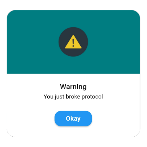
Let’s put this into context with a simple example. Picture a button in your app labeled “Show Alert.” When tapped, it triggers showDialog. This function then calls up an AlertDialog widget, which might say something like, “Warning! You just broke protocol” This is showDialog in action—grabbing the user’s attention with crucial information or choices.
Using the ShowDialog Flutter Method to Show AlertDialog
Implementing showDialog to display an AlertDialog involves a few steps. First, you need a trigger, like a button press. When activated, showDialog comes into play, using the current app context to know where to display the dialog. Inside showDialog, you define the AlertDialog, customizing its title, content, and actions based on what you need to communicate.
Here’s a peek at what the code might look like:
ElevatedButton(
  onPressed: () {
    showDialog(
      context: context,
      builder: (BuildContext context) {
        return AlertDialog(
          title: Text('Alert!'),
          content: Text('This is an important message.'),
          actions: [
            Elevated(
              child: Text('OK'),
              onPressed: () {
                Navigator.of(context).pop(); // Closes the dialog
              },
            ),
          ],
        );
      },
    );
  },
  child: Text('Show Alert'),
)
In this snippet, tapping the “Show Alert” button brings up an AlertDialog with a message and an “OK” button to close it. It’s a straightforward yet powerful way to communicate with users, ensuring they receive and acknowledge important information.
What is the Difference Between ShowDialog and ShowGeneralDialog?
In the Flutter universe, showDialog and showGeneralDialog are like two siblings with similar yet distinct personalities. Both are used to display dialogs, but they cater to different needs and offer varying levels of customization. Let’s dive into the differences between these two and understand when to use each.
Comparing ShowDialog and ShowGeneralDialog
Think of showDialog as the more straightforward of the two. It’s designed for simplicity and ease of use, perfect for popping up an AlertDialog or a SimpleDialog with minimal fuss. It’s like using a preset on a microwave – quick and with expected results.
On the other hand, showGeneralDialog is the more versatile sibling. It offers a canvas for creativity, allowing you to customize almost every aspect of the dialog. From animations to barrier color, and even the shape of the dialog itself, showGeneralDialog lets you tweak to your heart’s content. It’s akin to cooking a gourmet meal where you control every ingredient and how it’s cooked.
Customization and Use Cases
When you need a quick confirmation or alert, showDialog is your go-to. It’s best for those moments when you need to grab the user’s attention without needing fancy customizations. Imagine needing to confirm a user’s action, like deleting a photo. showDialog is perfect for this – simple, direct, and to the point.
For those times when you need a dialog that stands out or behaves in a specific way, showGeneralDialog shines. Whether it’s a custom animation to match your app’s theme or a unique layout that showDialog can’t offer, showGeneralDialog gives you the tools to build it. It’s ideal for creating immersive experiences within your app, like a tutorial dialog that guides the user with style.
Types of Dialog in Flutter
1. First, we have the AlertDialog, the most common type. It’s like a tap on the shoulder, saying, “Hey, you need to see this!” It’s great for confirming actions, like deleting a file or exiting a game.
2. There’s the SimpleDialog. Think of it as a multiple-choice question. It gives users a list of options to choose from. It’s handy when you want to ask your user a straightforward question and offer several answers.
3. The ModalBottomSheet. It slides up from the bottom of the screen, offering options or information. It’s like pulling up a drawer full of tools for the user to pick from.
How to choose The Right Dialog for Your App?
Picking the right dialog is like choosing the right outfit for an occasion. You wouldn’t wear a swimsuit to a wedding, right? Similarly, you wouldn’t use a SimpleDialog for critical alerts.
If you need to grab attention and get a quick yes or no, go for the AlertDialog. It’s direct and to the point. For giving users a list of choices without overwhelming them, the SimpleDialog is your friend. And when you want to present information or options in a less intrusive way, the ModalBottomSheet is a great choice.
Conclusion
Alright, let’s wrap this up! We’ve gone through a lot about how to insert Flutter alertdialog into your apps. From the get-go, we learned that alert dialogs are like little pop-ups that grab your user’s attention for something important. Whether it’s a heads-up, a decision to make, or just a piece of info, these alerts are super handy.
We started simple, showing you the basics of popping up an alert with showDialog. Then, we got a bit fancy, exploring how to make those alerts really stand out with showGeneralDialog. We even talked about making them look good on any device and how to switch them up for day or night mode.
FAQ’s
Can you customize the animation of a Flutter AlertDialog?
Yes, you can customize the animation of a Flutter AlertDialog by wrapping it in an AnimatedWidget or using the showGeneralDialog function. This allows you to define custom transitions, such as fading in or sliding up, making the alert dialog’s appearance more dynamic and engaging for the user.
How do you make a Flutter AlertDialog accessible for all users?
To make a Flutter AlertDialog accessible, ensure it is compatible with screen readers by providing meaningful semantic labels for all interactive elements. Also, consider the color contrast for users with visual impairments and ensure that all functionality is accessible via keyboard navigation for those who cannot use a touchscreen.
Is it possible to display a Flutter AlertDialog without buttons?
Yes, it’s possible to display a Flutter AlertDialog without buttons. This can be useful for showing information that doesn’t require user action to dismiss. However, you should provide a clear way for users to close the dialog, such as tapping outside the dialog or using a timer to automatically dismiss it after a few seconds.
How do you test a Flutter AlertDialog in widget tests?
To test a Flutter AlertDialog in widget tests, use the find.byType method to locate the AlertDialog widget, and then use tester.tap to simulate user interaction with its buttons. You can also check that the dialog displays the correct text and responds appropriately to user actions.
Can a Flutter AlertDialog contain a form with multiple TextField widgets?
Yes, a Flutter AlertDialog can contain a form with multiple TextField widgets. This is useful for collecting input from users, such as login information or feedback. Ensure to manage the state of the text fields properly and validate the input before processing it to maintain a smooth user experience.

